Peter Saville, Joy Division and New Order
Graphic-design icon Peter Saville is a bit of a celebrity in the world of album design, especially amongst post-punk acts that made their names in the late-1970s, early-1980s British scene. Joy Division, New Order, O.M.D. and Roxy Music are just some of the luminaries who have benefited from Saville's oftentimes enigmatic, yet strangely compelling graphics. Hardcore, compulsive aficionados of Joy Division and New Order have invariably become, by corollary, devotees of Saville's cover motifs as well, for those wonderful albums and singles that soundtracked the lives of so many cognoscenti-conscious mid to late-thirtysomethings. Here are some of the more striking Saville designs to have graced Joy Division and New Order record covers:

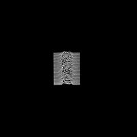
UNKNOWN PLEASURES (Joy Division,1979)
A bizarre-looking design for a jagged, scary album. That mountain range-looking pattern is actually a collage of 100 consecutive radio pulses from the CP-1919 pulsar. Art-wankery at its best.
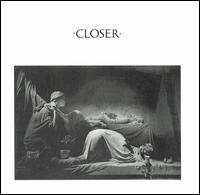
CLOSER (Joy Division, 1980)
Joy Division's second and last album has a palpable aura of despair and mortality hanging over the proceedings, and Saville appropriately played up the funereal atmosphere by using a close-up of a mausoleum in the Staglieno Cemetery in Genoa, Italy.

POWER, CORRUPTION AND LIES (New Order, 1983)
This by-now classic design for New Order's sophomore effort is a simple, elegant still-life painting by French Impressionist Henri Fantin-Latour that provided a sense of the band's quietly burgeoning confidence. They finally found their own unique style on this album, after the half-hearted Joy Division affectations of their first album ‘Movement’.
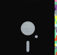
BLUE MONDAY (New Order, 1983)
The notorious floppy-disk design for the best-selling 12-inch single of all time that supposedly cost New Order and Factory Records to lose 20 pence on each copy sold (it's an apocryphal account, by the way).

LOW LIFE (New Order, 1985)
A unique, interactive design that features four interchangeable photographs of the band members tucked inside a semi-transparent sleeve, stamped with the band's name.

TRUE FAITH (New Order, 1987)
New Order's American breakthrough sports a straightforward, oil painting-based diagram for its cover. That falling leaf is perhaps a visual representation of the band itself, as they drift towards an unknown but promising future, after years of trying to break into the world's most impenetrable market.

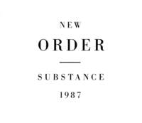
SUBSTANCE (New Order, 1987)
A stark, bold, modernist-informed theme for arguably the ultimate New Order compilation. Ridiculously simple, but assuredly effective.

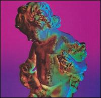
TECHNIQUE (New Order, 1989)
A Technicolor reinterpretation of a Renaissance-era sculpture? A tongue-in-cheek visual representation of an Ecstasy-inspired vision? Whatever Saville's original intention might be, this cover for New Order's best-loved album is a brilliant depiction of the house-influenced, acid-drenched Summer of Love of 1989.
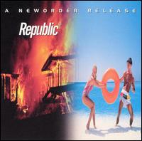
REPUBLIC (New Order, 1993)
As the finances of Factory Records quickly went into decline, so did New Order's intra-band relations. The design for this first release on new label London Records (the band's last one for almost a decade) effectively captures the spectre of discontent that hung over the recordings. The juxtaposed images of fleeting exuberance (the couple on the beach) and destruction (the conflagration) speak volumes about the contrast between the pseudo-stridency of the opening tracks and the sheer resignation of the closing tracks.

SINGLES (New Order, 2005)
An early-millennium reformation of New Order that spawned two flat-out brilliant albums (2001's ‘Get Ready’ and 2005's ‘Waiting for the Sirens' Call’) led to the release of this latest anthology, which collects in chronological order all the official singles. Saville's design, a smart, conscious update of the falling-leaf motif of 1987's ‘True Faith’ single, is both an acknowledgement of the band's illustrious past and an affirmation of their current standing as elder statesmen of rock.
UNKNOWN PLEASURES (Joy Division,1979)
A bizarre-looking design for a jagged, scary album. That mountain range-looking pattern is actually a collage of 100 consecutive radio pulses from the CP-1919 pulsar. Art-wankery at its best.

CLOSER (Joy Division, 1980)
Joy Division's second and last album has a palpable aura of despair and mortality hanging over the proceedings, and Saville appropriately played up the funereal atmosphere by using a close-up of a mausoleum in the Staglieno Cemetery in Genoa, Italy.

POWER, CORRUPTION AND LIES (New Order, 1983)
This by-now classic design for New Order's sophomore effort is a simple, elegant still-life painting by French Impressionist Henri Fantin-Latour that provided a sense of the band's quietly burgeoning confidence. They finally found their own unique style on this album, after the half-hearted Joy Division affectations of their first album ‘Movement’.

BLUE MONDAY (New Order, 1983)
The notorious floppy-disk design for the best-selling 12-inch single of all time that supposedly cost New Order and Factory Records to lose 20 pence on each copy sold (it's an apocryphal account, by the way).

LOW LIFE (New Order, 1985)
A unique, interactive design that features four interchangeable photographs of the band members tucked inside a semi-transparent sleeve, stamped with the band's name.

TRUE FAITH (New Order, 1987)
New Order's American breakthrough sports a straightforward, oil painting-based diagram for its cover. That falling leaf is perhaps a visual representation of the band itself, as they drift towards an unknown but promising future, after years of trying to break into the world's most impenetrable market.
SUBSTANCE (New Order, 1987)
A stark, bold, modernist-informed theme for arguably the ultimate New Order compilation. Ridiculously simple, but assuredly effective.
TECHNIQUE (New Order, 1989)
A Technicolor reinterpretation of a Renaissance-era sculpture? A tongue-in-cheek visual representation of an Ecstasy-inspired vision? Whatever Saville's original intention might be, this cover for New Order's best-loved album is a brilliant depiction of the house-influenced, acid-drenched Summer of Love of 1989.

REPUBLIC (New Order, 1993)
As the finances of Factory Records quickly went into decline, so did New Order's intra-band relations. The design for this first release on new label London Records (the band's last one for almost a decade) effectively captures the spectre of discontent that hung over the recordings. The juxtaposed images of fleeting exuberance (the couple on the beach) and destruction (the conflagration) speak volumes about the contrast between the pseudo-stridency of the opening tracks and the sheer resignation of the closing tracks.

SINGLES (New Order, 2005)
An early-millennium reformation of New Order that spawned two flat-out brilliant albums (2001's ‘Get Ready’ and 2005's ‘Waiting for the Sirens' Call’) led to the release of this latest anthology, which collects in chronological order all the official singles. Saville's design, a smart, conscious update of the falling-leaf motif of 1987's ‘True Faith’ single, is both an acknowledgement of the band's illustrious past and an affirmation of their current standing as elder statesmen of rock.
posted by C.T. Chua at 11:27 AM
167 comments
![]()
